I wanted this project to be something that I myself could learn from.
My family and I always travel around Europe to learn about the historical abundance in every place. But I didn't know much about Vancouver.
It is much younger than European cities, but it is still rich with past in its own, North American way. A past I decided to learn through documenting the inter-lapses of the old archives of the city with the present state of it.
At first, I was going to find parks that are now parking lots to capture something that is not there anymore, the surroundings that took over the landscape. But that appeared to be harder than I thought. (Vancouver is much more sustainable than Kiev.)
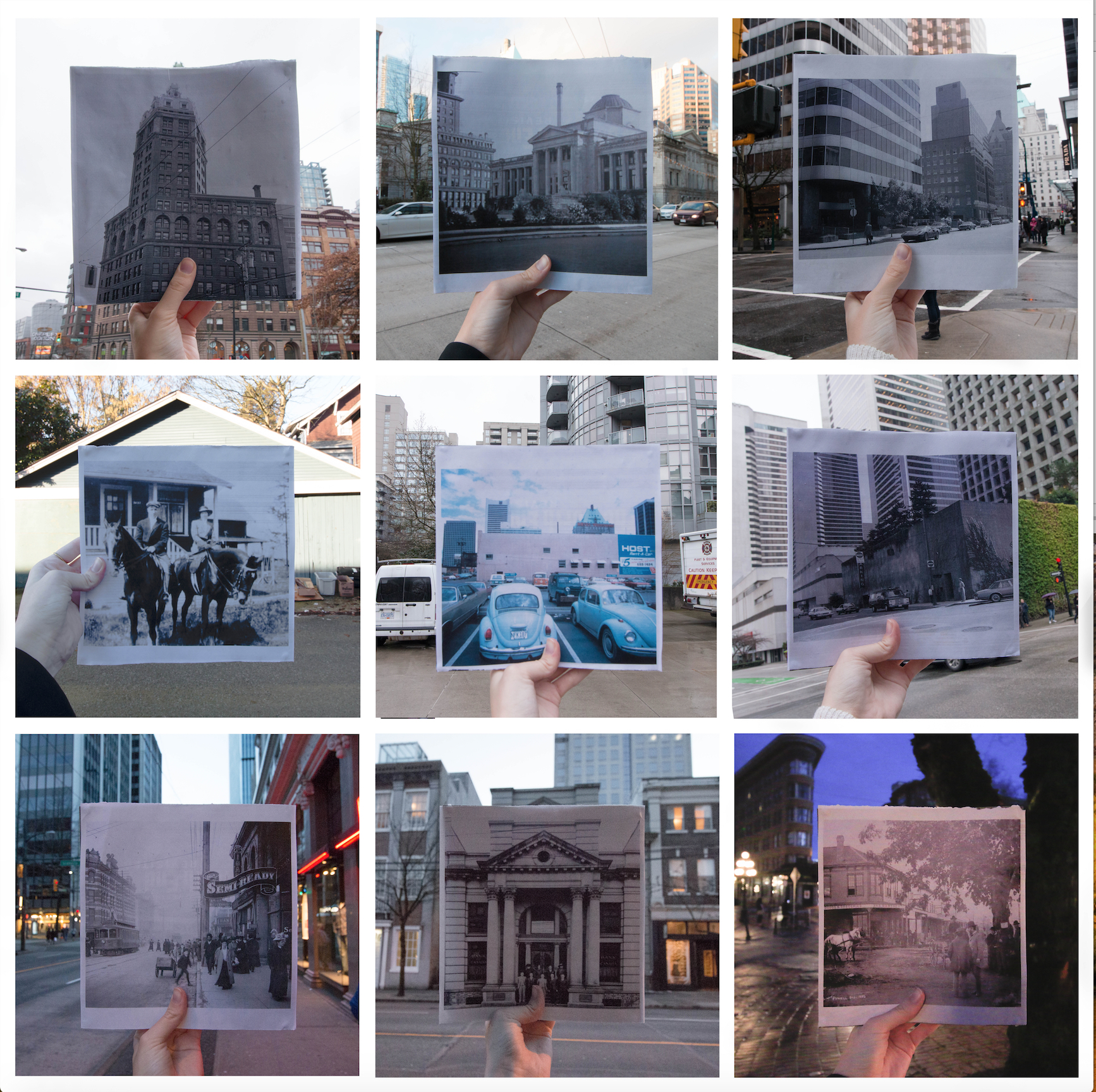
But I still wanted to establish a connection between the past and the present so I decided to have a physical presence of printed photographs from the past in the present photographs taken. I went to Vancouver Archives website and found photos that most interested me. During my whole day long adventure all over Vancouver I captured the modern surroundings around the archival photos mounted onto a square book cover (ironically street photography book “The North End, Revised” by John Paskievich).
I matched the positioning of the buildings in the photos so that the changes that happened over time would be more noticable. Some places got completely forgotten, some overruled by nature, some even remained unchanged, while others got erased completely (the photograph of the cars parked was taken at a spacious parking lot overseeing the Vancouver Hotel. Now it is a fire station surrounded by skyscrapers.)


This work has been the first work I have done for VISA 110 this term as well as my first ever archival / collage work.
Although I had a fair amount of experience with digital camera and Photoshop editing prior to this, I wasn't really sure what I was doing going into this.
I guess I was focusing more on the concept of the work and the behind the scenes work rather than the visual execution of it. Getting feedback on this work has helped me a lot with focusing on all the little details and inconsistencies. The knowledge that I am taking away from this learning experience is that when working on types of projects like these, one should keep everything extremely consistent so that the attention is drawn to differences the work is aiming to highlight.
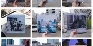
For instance here I present the after (on the left) and before (on the right). As one might notice, the way photos were previously organized is messy which leads to more time consumed by the audience finding the connections between the pieces of the puzzles.
However, by fixing the angles of the printed archival images, their positioning and size, the message becomes much clearer and the aesthetics of the work look much more put together.